All posts by Brightadmin

Go Live or go home

It has taken a pandemic but churches have finally been dragged into the 21st century in regards to technology. A small number had already been doing so, but now, streaming a service on social media platforms has been the new norm.

Now, as rules are relaxed on gatherings churches are having to make big decisions about physical meetings in a building. Lots to think about, lots to work through but one of the decisions I seem to be seeing a fair but is whether to aim the service at those gathered in the building or those gathered around a screen at home.

In planning their services, Churches who will be live streaming are wondering what part the various gatherings play. Do they ignore those present and talk into a camera as they have been? Do they ignore the camera (and therefore the people at home) and just focus on those present in the building?

The general consensus seems to be, we focus on those present in the building and those watching at home on the live stream will just be a witness to it. As if they are a neighbour, peeking over the fence sneakily.

I want to suggest to you, that is the wrong way of looking at it and once again that’s the church falling back on its old way of doing things. Do not go back to that! You have had four months of trying things out, being creative, engaging in totally new ways. I believe you can include both those in the building and those at home quite easily.

Now, it is worth saying, nothing will ever beat being present in the church. Nothing can recreate the gathering together and the sense of fellowship and unity it brings. But that is currently not possible and actually for many in churches it never will be. There are different seasons of life for those in a church and so you can guarantee there will always be a section of each church who have difficulty attending a service in a building. The need to include those watching away from a building is massively important these days.

I would also question peoples desire for meeting currently. My personal opinion (and of course it really is just that) is that church unity is most important in these times. Are you anymore united as a church meeting in a building? While some are left out of it? I would suggest that there is better church unity found if everyone is on a level playing field with church service access and until rules are relaxed enough that a large portion of the church can meet, we may be making things more difficult for ourselves.

That said, I have three very simple ways to include those at home watching the live stream in your service.

Acknowledgement

The first thing you can is at the beginning and at points throughout acknowledge you have an audience at home.

So when you greet those who are gathered together in the building, greet those who are at home also. Why not get the people gathered to give a wave and a hello? You could go a step further and do some shout outs! Engage with your audience, make all those gathered in the church building, aware there are many more watching at home.

And if, during the sermon, there is a question being asked, don’t just aim it at those in the building, reference those at home. Instead of ‘what did you have for breakfast?’, ‘those here and those watching at home, what did you have for breakfast?’.

Its a simple way to acknowledge and include your audience.

Positioning

There are of course many places to put your camera(s) for the live service stream. Sometimes this is dictated by the shape of your building or the position of the preacher. But, if at all possible, the best place to put the camera is right where people sit. Not in right in front of the preacher, not right at the back, but where the physical congregation are sitting is the best place to feel part of the service.

Why? Because those watching at home we instantly identify the perspective of the camera with sitting in those church chairs watching the service as they once did. Muscle memory kicks in and the audience is taken back to a time before Covid when sitting in the congregation, feeling part of something bigger was the norm.

It is easier to do this currently as with the two metre rule for churches there are plenty of spaces to put your tripod. It also means that the camera, at the height of someone sitting down will not be obstructing anyone.

Now of course this isn’t always possible, but whenever deciding these things, always keep your home congregation upmost in your mind.

Eye contact

Again, another simple idea but very effective. Look at the camera. Not all the time, not like you have been for the past four months but as you look around the room, look at the camera.

You will notice as preachers talk, they use points of reference in a room, they will look over to this Side, then in the middle, and over this side. Wherever your camera(s) are setup, use them also as a point of reference.

This is easier if your camera is at eye level, somewhere behind the congregation but even if your cameras are high up fixed on a side wall, it is still possible. It will feel a bit weird to begin with but if you have done the acknowledgment as suggested earlier, those in the congregation will understand why you are looking in a weird place. It will take time but if you understand that this is a long term, permanent setup the whole church will get used to it.

Those are three very simple ways, there is a fourth way but this requires some technical know how and so may be a step too far for a lot of churches.

Include video in the service

Whether it’s a bible reading, a testimony or something else, playing a video from someone not in the physical gathering is a great way to include them in the service.

The video could be a live stream from their home or a pre recorded message. It could be shown on a screen to the congregation and the live stream could have the video footage included in the stream (rather than just looking at the screen in the building – although that could be a fall back).

There you go, two easy ways, and one slightly trickier way to help make those gathered in the building and at home feel part of the same service.

Come on churches, don’t fall back into what’s comfortable, keep being creative for Gods glory.

Change is good for churches

I’ve seen a lot of blog posts and videos lately on how to do streaming and what to use. All good stuff, and I don’t disagree with the vast majority of what people are saying. The problem is, whilst a lot of churches need hand holding in this current climate, it isn’t going to solve a longer term problem. That problem is making your digital outreach a core part of church life.

Yes, most churches have websites. A big part of my job is church website design. I’m an advocate for churches using digital platforms as an extension of church life and outreach. But the mindset, at the moment, seems to be what can we as a church do to get through this? They are looking for temporary digital measures to replicate the regular church events.

The issue here, is two-fold. Firstly, social media platforms weren’t built for this and users’ online mental model differs vastly from someone walking through the door of a church building.

Secondly as soon as normal life resumes a lot of good work from churches online will be undone as they stop their digital outreach. The mindset is temporary; the mindset is to do what we’ve always done once the lockdown has passed.

Let me say at the outset, I truly believe in the physical gathering of God’s people, this should be central to church life and nothing should replace that. I do, however, want to urge those that have the power, to think these things through carefully. We are in a unique situation right now, we as God’s people have a chance to adapt, innovate and grow.

In thinking through these things I want to make some quick points about why it’s worth reviewing our mindset about the way we do church.


Reaching new people

Have you ever despaired that the church isn’t making an impact? People don’t want to listen and certainly won’t walk into a church building. If only we had the opportunity to reach those that don’t know Jesus? If only people were willing to listen?

Well guess what? This is that moment, an opportunity to form new relationships, for the church to be central to their community. Sure not physically but online is a great place to start. There are a load of people, with a lot of time on their hands, skimming through their facebook feed looking for some entertainment, some distraction, some hope.

Where are you? Where is the content that your church members can share to their friends online? The church has a great chance to be central to online discussions on the situation we are in. People are questioning the very things that they thought would provide safety and comfort, health, jobs, money, friends, family, it’s all been stripped away and where are we? What is our message? How are we enabling our church members to have these discussions?

I have been amazed how many churches are using closed facilities for their online messages. Messages of hope and challenge are being preached and who is hearing it? Church members! You’ll have to excuse my annoyance but these are the very messages that should be pumped out on social media platforms, that people can pick up on and hear. That Christians all over can share with their nearest and dearest. What an opportunity, don’t waste it! If you are using a closed platform that only invited guests can access, stop it now.

I know it’s easy right now to only think of church members in this time, and yes they should be a priority. However, my personal belief is your focus with digital platforms should be everyone else. The lost, the scared, the worried, the angry, the grieving. These people who do not know Jesus need to be reached, make them a priority.


Church isn’t Sunday

If we accept the premise that first and foremost the churches social media channels are for those that don’t love Jesus, the shape of the content we produce should change accordingly.

For instance, I’ve been amazed how many churches are trying to just replicate a Sunday service online. Why? Because if it isn’t exactly like we do it on a Sunday that somehow the church body will fall apart?

Sure, praying, singing, God’s word, all vital. But they don’t need to be stitched together for online consumption. Are you expecting people to sit through a whole service online? People aren’t used to that, you know who are used to it? Christians.

Social Media was not meant for such things. The mental model of the majority of social media users is quick digestible content with memorable moments that resonate with the end user.

We have the ability to break the mould of church. Instead of playing into the stereotype that church is Sundays, we can share church all week. Smaller bite-sized content throughout the week. Youth talks, kids songs, daily messages from pastors, maybe even take some parts of the Sunday sermon and published as smaller sound-bytes? Instead of spending hours putting together a well designed Sunday service during the week, spend that time on your social media channels producing content that your members can share and the end user can easily digest. Get church members involved, make it natural, make it interesting – that is the point of social media.


Church isn’t a building

There has been the often argued stance, that the minute a church starts streaming their service people will stay at home to watch instead of meeting with their brothers and sisters. I have spent some time talking with churches who stream their services about this and there is absolutely no evidence that this is happening.

We need to stop thinking that church is the building. That everything the church does has to be through the building. I know we say we know that, but honestly, when churches organise things, it’s always in the building, always in the same format.

This is a time to learn that Gospel outreach can and should happen outside of the building. I’m sure church members are encouraged to do so but how about the church as an entity? Could you do your Christianity Explored somewhere other than the church building?

Hopefully in this time we can learn that church activities don’t need to include the building, they can happen whenever, wherever. They should happen where people can be met.


Innovation can be good

A few weeks ago our midweek bible study group met for the first time using Zoom. It made my heart soar, it lifted my spirits and I couldn’t wait for the next one. It wasn’t because I got to watch something other then Peppa Pig (honestly this lockdown has me hating on that pig family). It was mainly because for the first time in probably ever that all 18 of us were together. We have a number of young families in our group and obviously only one partner can come. But not now! Everyone can join in and although it’s not the same as being in the same room it was great to share that time with those who have felt sidelined because of having a young family.

Churches who innovate are able to draw in those on the fringes, that can’t engage as often. It is an incredible moment to ask, how can we do church differently? Think differently, approach it differently, deliver it differently.

I know several churches using a dial-in phone service to hear the live sermon preached, which is great for those without internet access or find the whole thing too confusing. Those churches have also said they plan to keep it once normal life resumes.

Churches often shy away from creativity and innovation because it moves away from the tried and tested models of yesteryear. Which of course have their place, but we must always look forward. Who can we engage with that we aren’t currently? Who are sidelined that we can draw in? How do we do it?

Answer those questions and you will find ways of doing things that you weren’t previously.

It’s certainly my hope that we keep something of our online midweek group so those that aren’t able can still share that precious time.

Once this is all over ask members what they liked and what they want to keep, what was helpful, what worked. Don’t throw it all away, move forward armed with extra tools, not replacements.


A new mindset

My hope is churches through this will gain a new vision for how church is done. That their digital offering isn’t just to promote the Sunday gathering or the midweek youth group, but actually to support the work of the people with content made specifically for digital platforms.

This is a new horizon for gospel work, finally churches are being made to use the very things they have avoided, they are using digital platforms in a way they never have done before.

My prayer is churches, passed the current horrific situation, grab the opportunity to learn how to best utilise digital platforms, to serve their members and to reach out to their communities.

God’s work is not restricted to a Sunday, it is not restricted to a building. We have the ability to reach people in new and different ways, take what you are learning in this temporary situation and decide what things could be made a permanent function for God’s glory.

Streaming for the church

So here we are… Crisis point for the world and it’s up to the internet to keep sane (that’s something I never thought I’d say). I’ve already seen many taking to social media to offer classes and groups for interaction and well being.

It’s brilliant to see so many churches now embracing social media as an extension of their fellowship and outreach. It has intrigued me to see how churches are handling their digital offering, so much so that I thought it might be worth giving some advice on such things.

There are lots of great posts already out there about what services there are and what can be achieved, this isn’t one of those posts. This is directed at church leaders and those that are making decisions about streaming .

In my years of church website design my approach is to stick to the KISS principal. KISS stands for Keep It Simple Stupid.

I have seen a lot of church streaming setups over the last week, cameras, computers, all kinds. Setup in churches, very fancy, very cool.

The problem with that is, at some point we will move to a time of not being able to get to our churches to use our fancy setup. My advice to the decision makers is to follow a KISS principal.

Don’t overthink it
Yes, there are loads of great tools out there, and it’s tempting to use the latest and greatest technology. The problem with this is at some point you will have to downscale your setup to accommodate the situation. The better thing to do, is to start small and build out from there. If you are streaming on premises at a church with all the gear, don’t. You’ll have to downscale that when the inevitable lockdown happens. Start small, start simple, and as you grow with confidence you can add things.

Enable your pastors
Your choice for streaming should be based around those who will be preaching. What is their level of technological understanding. At some point we will not be allowed into a church building and they will be in their house streaming the service themselves. Help them, come up with a setup they can use and continue to use for the next few months. The more people and steps you can take out of the process the more KISS it becomes. At this moment in time, simple trumps fancy. If you do it now and slowly upscale you won’t need to downsize the incredible setup you had before. Do it now!

Enable your church
This time is a great opportunity not only for the church leaders to have a voice on social media but also for the church as a whole. What things can you encourage them to be involved in the churches online voice? User generated content will serve you well during this time. In a future post I’ll suggest some ideas of things you could encourage the church to do during this time.

But mainly, follow the KISS principal

Church website shortlisted for award

I’m not normally someone to blow their own trumpet but sometimes I will allow myself a little shameful boasting. And today is that day!

The church website I designed and built for Zoar Christian Chapel has been shortlisted in the ‘Most Engaging Small Church Website’ category at the Premier Digital Awards 2018. Although I never do it for the accolades (just as well as I’d be a poor man), it’s always nice to be recognised for the time and effort gone into each church website design.

The website was a bespoke design reflecting the church’s personality and characteristics, though small and traditional has a very big heart for its community and reaching out. I worked with the church to ensure a website that was representative of them and what they are trying to achieve.

This is the second time a church website design I have created has been shortlisted for an award at the Premier Digital Awards. A few years ago the Monyhull Church website came runner up in the ‘Most Engaging Large Church Website’ category and it’s great to once again be recognised for my work.

Win or lose the satisfying part is creating a church website that supports the local church in their activities.

Now, time to create a trophy cabinet.

Security certificates – Google cares, so should you

Site security and online privacy has, in recent years, become more of a concern. With websites needing to gain the trust of its visitors and to ensure a users every move is not being monitored without them being made aware is all part of a users experience. Without this experience your website and your brand could be deeply impacted.

However, recent changes to Google Chrome web browser, changes to the law and the introduction of GDPR data regulations now means this area of concern takes on greater importance.

Whats changed?
The latest version of Google’s Chrome web browser alerts users when they visit a web page that collect personal data. The warning states that the website is ‘not secure’ and makes it look like there is a problem with the security of a website. This could damage credibility and trust for many website visitors if they think their information can be stolen and misused.

As well as this the General Data Protection Regulation (GDPR) will apply from May 2018. The GDPR is a legal framework which websites must adhere to. This includes security of personal data.

What is a security certificate (SSL)?
SSL, which stands for Secure Socket Layer, is an encryption technology used to create a secure connection between a web server and a user’s web browser.

When a website has an SSL certificate installed on the server, a small padlock icon is displayed to the left of a website URL in the browser and https will appear as well before the url. SSL certificates are used to secure data transfers, credit card transactions, logins and other personal information. They provide security to customers and make visitors more likely to stay on a website for longer periods of time.

So why bother?

It’s safer site visitors
HTTPS keeps the information sent between the browser and the user secured. The SSL encryption layer prevents data attacks by stopping unwanted users from intercepting data that is passing between the two. This is especially crucial to prevent for e-commerce websites where credit card details are entered, or for websites that allow account creation and store sensitive information.

Website visitors want to know that the information they are sending is secured. Any issues with data security can impact your brand negatively.

Improves search rankings
Google has, for many years, encouraged site owners to improve a users experience especially in regards to data. Since 2015, Google will search for and index HTTPS URLs before HTTP URLs. By June 2016 Moz found that over 32% of page 1 Google results are using the HTTPS protocol which is a big increase since being first announced by Google. It is clear that Google now place weight behind websites that have a security certificate and in terms of competetition, every little helps.

No more nasty warnings
Since Google are now reacting to sites without an SSL, it’s hard not to miss the warnings non-secure websites are throwing up. Any site visitor that sees a site marked as ‘insecure’ will quickly run away. For reputation, trust and user experience alone it’s enough of a reason to implement one.

Facebook advertising for churches

Churches for many years have used the same form of communicating events, word of mouth and leaflets. These are good but to reach and engage people a lot of churches have yet to tap into social media as a means to reach their audience.

Yes, I know, social media is evil, the internet hates you and we must go live in the hills away from technology. Then again, you’ll never be where your audience is. And that’s kind of the point isn’t it?

Your services, your events, your message, you want people to know it, to see it, to be part of it. With leaflets its every difficult to target an audience (did that old person really want to see the leaflet about kids clubs?) and even harder to measure its success. If only there was a way to be a bit more targeted and find people where they are at…

Behold, Facebook

Yes I know this isn’t news and I know people are already using it to advertise. And yet churches seem some way behind to use it as a means of engagement. The beauty is, you need to do very minimal work to reach a more targeted audience then a leaflet drop ever would.

Here is a quick look at some of the basic targeting features that will aim your campaign at the right audience:

Geo-targeting – Facebook ads can be aimed at specific geographic areas right down to the Postcode level.

Demographics, interests, or behaviours – Facebook campaigns can be aimed at people within specific demographic groups. It can also be aimed at people with specific interests and behaviours. For example, a campaign can be aimed at people who are interested in improving their parenting skills, or a family seeking a sports ministry for their kids.

People who like specific Facebook pages – Facebook campaigns can even be aimed at people who like specific Facebook pages.

Adverts ahoy

You have several options with Facebook adverts as to what can be used:

Single Image Link Ads – Churches can use single image link ads to attract more people to their website. These single image link ads are clickable, and the photo, text box and call-to-action button all link to your church’s website.

Multiple Image Ads – These ads are in a carousel format. The carousel format allows you to show 3-5 images and/or videos, headlines, links, or calls to action in a single ad unit. It can be used by your church to accomplish a variety of communications objectives.

Video Ads – With massive growth in video viewing on Facebook, churches are spreading their communications messages with Facebook video ads.This could be a leadership message, an invitation, a snippet from a great sermon, or any other video message your church wants to show to it’s neighbours.

Death to flyers

No, not really. They still have their place. But there are other ways to reach an audience and the church must make use of them. Targeting is easier, more people will see it and it’s cheaper. Take a look, get involved.

Church branding – what’s the point?

Many church leaders (and indeed church members) think branding is a dark art and that churches should run miles in the other direction. Thoughts turn to evil corporations and vast amounts of money wasted. In a church context most believe that only mega churches have any kind of formal branding and to do so would mean buying into marketing and in turn compromising what we stand for (yes this really is how I’ve had it explained to me).

What is church branding?

Before trying to demystify branding it’s worth understanding what it is. Most people think its a logo. In part this is true, there is the visual element to it. But branding is more than that, its an idea, a philosphy. When you talk about building a brand you are defining what an organisation is and what its about, a set of standards which the organisation must maintain.

The visual outworking of this is seen in a logo and its supporting design elements, imagery, fonts, colours. These should carry through to publicity materials and the website.

Why church branding?

So you understand that, good. But what’t the point? Does it make any difference? The first thing to say, is the visual aspect of your branding will never convey everything you are about. That’s the organisations job. What are the values your brand is promoting? Friendliness? Inclusiveness? Vibrancy? If I turn up to your church and am given the cold shoulder in an old dusty church, then you’ve done a bad job of executing your brand, no logo in the world can change that!

What it gives you is a visual cue that can be used to align yourself with certain values. It means, when a branded flyer drops through a neighbours letterbox, they know who it is and what they stand for. They begin to be comfortable with what your about and will form an impression of the organisation.

It will also help to show people how serous you are as an organisation. A well thought out design which has the right amount of information is a lot more appealing then two sides of an A4 sheet crammed full of text that know one will read. Thought has gone in to how something looks because the organisation cares about who will read it, its not amateur hour, time and effort is poured into communcations and publicity. This in turn gives an organisation more credibility.

Of course once you engage with your audience, its up to the organisation to display the churches brand values – so make sure you know what you are and who you are!

How to do it

Its not too difficult to achieve in all honesty. In fact, churches should already have half the job done. A church knows what they stand for, what values they hold on to, what personality the church has, what passions and drivers motivates them. It just needs to be formalised in some kind of document. Then from that work on how to visually represent it.

This is the point you made need a designer/web designer, you may have someone in the church who can do this. In manyw ays the point isn’t so much about what it is, but the fact that you have an idea, a representation that will be consistently carried over all materials and media to engage and create familiarity

7 Do’s of Church Websites

1. Do think about who your aiming the site at

I’m sure the new church website isn’t the only thing going on in your life (surely not?!!), taking time to plan out what you want to say and to whom is probably not very far up on your list. But would suggest the planning stage is the most important. If this stage is skipped you will, more than likely, end up with a half usable site which eventually gets left by the wayside.

Ask the questions that will inform the design structure. Who are you aiming this site at? What kind of people will be using it? It would be easy to say everyone, but that just simply isn’t true. You want to engage with your local audience first and fore-mostly. Who are they? Are you aiming at members or people who know nothing of the christian faith. You can the start thinking about what they would find useful, what questions they are asking, what kind of information they are trying to find. Spending time earlier on thinking these things through will pay dividends in the long run.

2. Do consider what your members would and wouldn’t use (functionality overkill)

There is nothing worse then a website that isn’t used. Sparse areas where once thriving information stood, old deprecated functionality that has gone untouched since Spurgeon gave his last sermon, these are all signs that the site has become unfocused and unmanageable. A lot of the time this is down to the planning stage. Mapping out what your users will and won’t use as well as what the website admin will and won’t do is key to a engaging and updated church website.

The times I have sat down with a client and asked what they want to be able to achieve with a website and they come back with the kitchen sink! Everything from member profiles to SMS push messages. These things of course are good and achievable, but I have become quite good at guessing whether a church will use something or not as I get to to know them. Want an event feed? Great, will you updated continually? A Twitter feed? Fantastic, how often will you be interacting on social media? Be realistic about what you will or won’t use. Keep it manageable and you (as well as others) will be more inclined to keep on top of it. Sit down at the beginning of the project and work out what you would use and what the church as a whole would use frequently.

3. Do the basics (where, when, what’s it like, contact)

It may sound strange but cover the basic information, especially on the homepage. The amount of new shiny websites that miss out basic information. Oh yes you’re very pretty with your big header image and cool animations, but wheres your service times? What do you mean I have to click through twice to find your address?!!

A lot of users will be people needing the basic information in preparation for attending, sometimes (like when I’m on holiday) it will be as they are getting ready to go for the service! Times, places, contacts – make it accessible and make it obvious.

4. Do update your site with content

Nothing encourages people to not return to your site then a lack of updates. You are a church, you must be doing something! Users are evaluating the church all the time, especially when on the website. What do you offer? What do you do? How do you do it? You need a way of pushing content onto the site to give users an understanding of what you’re about. A window into the life of the church.

This doesn’t mean putting the years members meetings notes online but churches more than other organisation run events, meet regularly and have plenty to say. Consider having a way to add events, run a blog or at the very least be active on a social media platform and link it through to your site. Even better is if each ministry page were able to add events to their own page so users could see events just for their area of interest.

I appreciate this costs time (and possibly money) but old and stale content will quickly turn users away with very little reason for them to return.

It doesn’t have to be a lot, but do be consistent. Have a set time in your calendar for adding a blog piece and plan it so its manageable. One blog a week or a month is better than nothing. Find people who would be willing to help with content and content ideas, this should help keep the content diverse and fresh.

5. Do update your site for security

Statistics released some time ago suggested that 73% of open source CMS’ (wordpress, joomla drupal etc…) were due to out of date versions. Keeping your sites core code up-to-date is critical for the safety of your website.

Often, the church website is finished, the owner will find some cheap hosting, send it live and forget about it. Do not be that person! Firstly, be selective over your web hosting – normally you pay for what you get. If you buy cheap hosting, expect a server that is less than secure causing plenty of site performance issues. Find a decent web host, get your site live, then update your site every month. Annoying? Yes, but unfortunately some people take great pleasure in turning your beautiful new website into something very spammy.

If you do not have the time, find someone who does. Alternatively make site maintenance part of your costing with web hosting (for instance I will charge an annual fee for hosting and site maintenance, I then make all updates throughout the year)

6. Do have a responsive website

For those of us in the web development game, this is a no-brainer. Your site should be responsive. That is, it should respond to the size of the screen. Whether your visitor is looking on a mobile, tablet or widescreen the site should adapt to its environment and present the information that works for that screen. No scrollbars, no having to zoom in, no clicking on tiny links. A good user experience means the user will more than likely be back. For church web design this should be a standard not a luxury.

Google places a great deal of emphasis on web design best practice, their algorithms for search placements include ranking a site based on how well its coded and if a site responsive or not. However, just to be clear, the days of having a separate mobile site are over. Yes some big companies still have a mobile specific site and they shouldn’t. The different with a responsive is that you use the same html code but it adapts to the screen size. This way the same information is being served to both desktop and handheld users.

7. Do make your site a window into church life

This list as well as the 7 Don’ts of a church website design should give you a steer in the right direction for starting and maintaining your church website. It is however, worth highlighting the main function of your site – a window into your world.

All that has been outlined is to help you better present the church. As a church web designer my biggest job is to convince pastors/committees/the tea lady that a lot of users are just curious, they are trying to work you out as an organisation and are seeking to get to know you. This means should they ever walk into the church, they aren’t going in blind, they have some idea who you are, who they might meet and feel more at ease.

Focus your website on showing what life is like in and around the church. What the stories of the people are. And don’t think that a small church has less to say then a big church, I have known huge churches never update their site and there is no engagement, I have seen small churches who use their site well with updates, blogs and photos. This isn’t about how full your programme is but showing the life of the church to your users so they can imagine themselves as part of it.

7 don’ts of Church websites

1. Don’t use stock photography

I start with this one as I truly believe it can make or break a site. Imagery is important, no scratch that, authentic imagery is important. Anything that helps give a user insight into your church is important. The church website is a window into a churches life, its people, its activities. For visitors to your website, seeing real people, doing real things evokes a feeling of trust and transparency. It shows there is nothing to hide and the church is quite happy for everyone to see them warts n’ all. This also helps connect a digital world with the physical world – when someone, who has visited your website, then visits the church and sees the same people from the website, this can help relax people and help them feel a bit more comfortable. Spend money on a photographer or find someone who has an interest and an eye for it.

The alternative is stock photography. Now don’t get me wrong I have used my fair share for churches who don’t have many other options, but if you are going to use it, use it sparingly. Stay away from the boring, samey, stereotypical imagery that will not engage users, especially on the homepage.

2. Don’t use ‘christianese’

The danger of being in a church and moving in christian circles is that over time you adopt the terms and phrases that make you sound like a theology ninja, some kind of religious big-shot. That’s all well and good when you want to impress your minister but ‘christianese’ has no place on your website. At all!

Its not about dumbing down, its about simplifying things so its user friendly. How many people actually know the five points of calvinism? Oh you’re an evangelical anglican church that believes in pedo baptism! Good for you! No one in the real world knows what that means. Break it down, even words like ‘sin’ have lost its meaning today. Why not get someone outside the church to proof read it and point out all the things they don’t understand, it will surprise you.

By all means have a statement of faith, but reserve a page further into your site, that can be found by those interested, for the more in depth theological statements.

3. Don’t have random bible verses with no context

In churches up and down the country good biblical, contextual preaching happens. Taking bible verses out of context, or even worse, making them say what you want is a big no no. We are taught good handling of the scriptures requires reading and studying in context. Why then do so many churches, as a default, feel the need to just slap a bible verse on their website. No explanation, no background, no exposition. Leaving it to the site user to understand what it means and why you’ve placed it there.

There is absolutely a place for scripture on websites, but give it a link to a page that opens up the verse, don’t stick it in as a footnote on your site, its criminal. Most visitors will be new to the church perhaps Christianity!

4. Don’t ignore the church website design

Whilst your websites primary concern is its content, mention must be made of the design of your church website. The tendency is to use every colour under the sun, the brighter the better! Leaving a site totally unbalanced and the end user with sore eyes and unsure where they are supposed to be looking.

Ideally your church has a brand, use it to inform your church website design (what do you mean you don’t have a church brand?!!). With this as a guide you can plan out how the site will look, what to bring focus to and what doesn’t need to be so in your face. A nice church website design will have pleasing touches like hover changes on links, info areas in some form of container or with a heading, to build some information hierarchy.

Chances are, if it looks like a mess, the user is less likely to engage. If it looks amateurish that will be the lasting impression you will be giving off about the church.

Similarly for fonts, the brand should lead the usage of fonts, what to use for headers, for links and main text. Don’t use every available font, don’t have crazy sizes. There should be some standardised type design for the site, which breeds familiarity. This is a good thing.

5. Don’t create information overload

Closely tied to font usage is the content of the site itself. I’ve seen many church websites that cram their home page full of text, presuming the best way to inform is to cram it down the users throats. Unfortunately all this achieves is an assault on the users eyes, as they can’t work out what to look at and where they should be looking first. More often then not this leads to users switching off and glazing over.

White space is good. It allows information to breathe, it allows the users gaze to be drawn to pieces of information. They won’t read through reams of text, online visitors consume information in chunks. Make it readable and guess what – people will read it.

6. Don’t be contactless

I am always surprised how many times I have heard people have filled in a contact form to never hear from that organisation in return. Contact forms are useful, it means you don’t need to display an email which encourages spam. Contact forms aren’t evil, but if these forms aren’t being piped through to someones email, the user will never get an answer.

Because of this, there is a default position that a contact form is managed by some kind of automated robot that only has three or four stock responses. I have seen real value in highlighting on your contact form who it will go to and how long it will take for the church to respond.

7. Don’t rely on ‘the tech guy’

Whenever I build a church website, I supply a manual of how to do everything on the website. I encourage the church to have two or three trained up on how to use it. It is a dangerous game to only have one person looking after the website. Yes there should be someone in heading it up, especially in a small church but there is no excuse not to get somebody else involved who knows how to do the every day jobs. They aren’t difficult tasks and with a manual in front of you it’s hard to go wrong, indeed after doing it once or twice you won’t need a how to guide anymore.

Also, if others are involved, they can come up with ideas on how to improve the site in the future. Perhaps new features or improvements of existing functionality.

Reimagined: Santander

Being a customer of Santander, I am constantly faced with the eye sore that is their website. With a spare couple of nights I decided to have at look at if they as a bank could be better represented.

I’m not a massive fan of the bank, I’ve had countless problems with their awful admin systems and terrible customer support. So as a side note, their site isn’t their biggest problem, not by a long stretch! Still, it doesn’t stop me having a go at tidying them up.

The first thing to say is, that we won’t be playing around with information architecture. That is a separate blog post altogether and way beyond this experiment. True to say Santander (and most other banks) should be looking at it though. Also, this isn’t a branding exercises, so we will keep the main Santander red as a starting point for the site.

Banks have two types of customers, pre-existing and potentials. We will concentrate for the most part on pre-existing customers (like myself), as most potential customers will seek advice outside of a banks website to see whats right for them. (moneysavingexpert etc…)

So, on with the show…

Research

Two types of research have been covered. Internal, that is, current banks websites and the functionality and similarities across the board (after all, there must be something in it if they are all doing it). After that is an external look. A questionnaire to current bank users (some Santander some not).

Bank websites were remarkably similar across the board with only one or two bucking the trend for layout. Obviously these sites are heavily leaned towards function and so couldn’t complain on that level, but it seems they stop there and haven’t connected function and style into UX design.

Some bank website trends worth implementing in some way:
– Big product list at footer
– Extra products with benefits list
– FAQ & Question box
– Online bank link

On top of that, the questionnaire (not extensive, 12 people, just a flavour of their experience).

From this questionnaire, the following has been highlighted as of some use:
– Account login
– Calculators
– Find a branch
– Customer Support

The following notes regarding the users overall impression, reveals the following:
– Too scattered
– Too many links to look at
– Celebrity endorsement is a turn off
– Existing Customers are an after thought and no longer cared for

Summary of problems

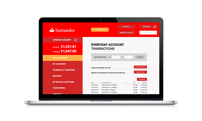
Having done some research and reported the findings, I took some screen grabs of the site, and using my findings, as well as my own thoughts, started to pick apart the site.

Scan1

For clarity, here are the main pointers:
– As a company they don’t connect with customers (celebrity endorsements)
– Most common tasks don’t stand out
– Current customers feel they are an after thought (they have a small sidebar to the right).
– Too many links all over the place
– Lots of products but no explanation as to how they benefit the customer
– Calls to action not obvious enough
– Current customers not buying in to new products
– information going down the page not necessary (What I’m not doing is reading through all your guff. I’m looking for a product, an answer, as soon I find the right link I’m not looking any further. I’m not on the site to browse).

Possible Solution

In all, most of the functionality of banks website aren’t bad, they are just poorly executed
– Site needs to be cleaner
– Easy navigation
– Lose celebrity endorsements, nobody cares
– Explainer videos for home page products highlighting exactly what the product will do for the customer
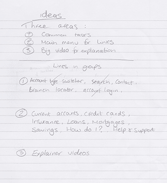
– Main tasks grouped together (Common tasks, products, product explainer videos)
– Bring existing current customer value in line with potential customers (do something with the small right sidebar)
– Show contacts for customer support
– Options are too cold, start each sidebar with a help option, for a customer focus rather then product focus
– Foldable list of every link in departments
– FAQ (everything should scream helpful)

A bit of wireframing jiggery pokery…

Scan2 Scan3 scan4

And here it is…

mockup2 mockup3

mockup4